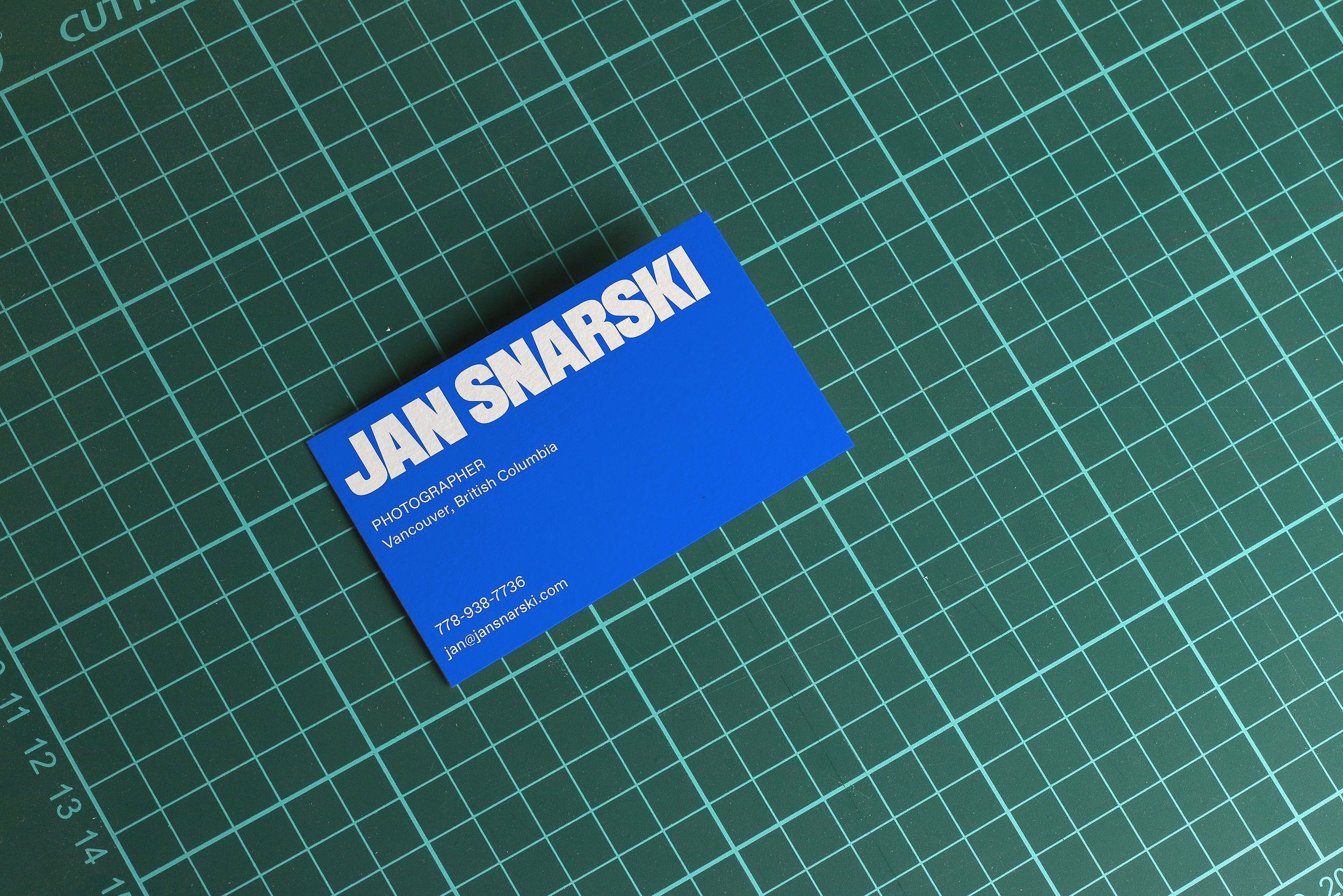
JAN SNARSKI
Branding + Layout Design
Collaborators
This branding project focuses on bringing a vibrant and exciting feel to the work produced by Jan, by taking colours from within his bright, poppy and playful photography we were able to then develop a strong and impactful word mark to follow.
When approaching this, we wanted Jan’s photography to do a lot of the talking for itself, so instead of developing a complex system, we decided that a strong and visible san-serif word mark with a bouncy colour palette would do the trick. This creative decision allowed for the word mark to be used in various ways, wether that was along side an image or placed on top of it, our approach allowed for Jan to have a strong visual identity through not only his imagery, but typography as well.


